Brand Guidelines
A comprehensive guide to maintaining the visual identity of Create Racket.
July 2025
Introduction
These guidelines are designed to ensure consistency and coherence across all brand communications. By adhering to these standards, we strengthen our brand's recognition and impact. This document covers essential elements such as logo usage, typography, colour palettes, and imagery.
Logo
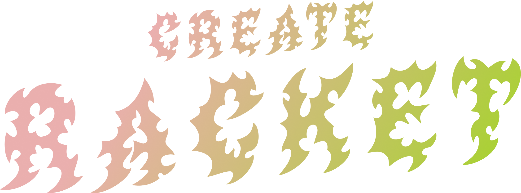
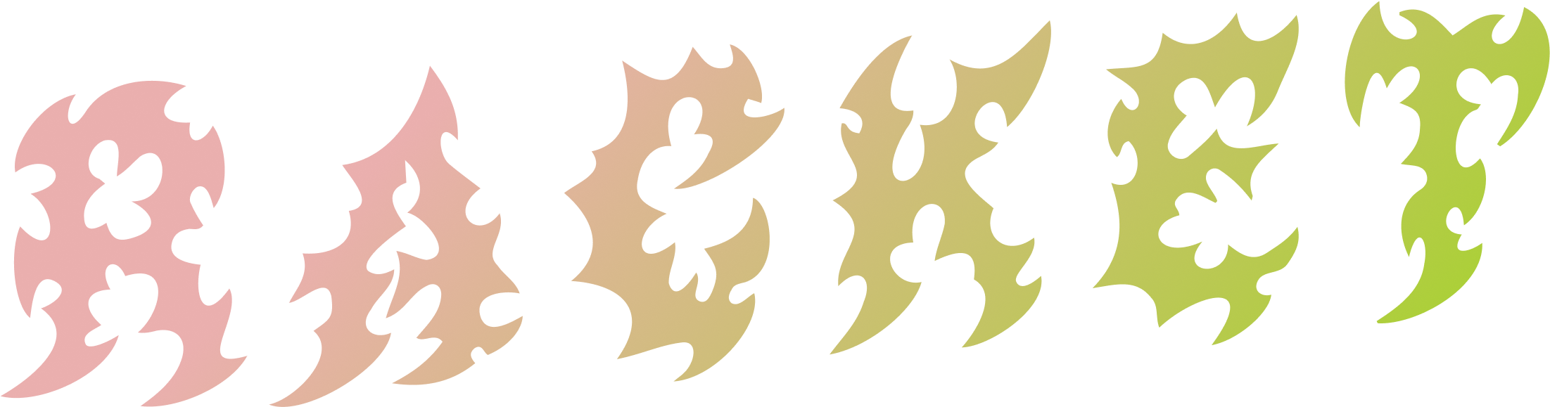
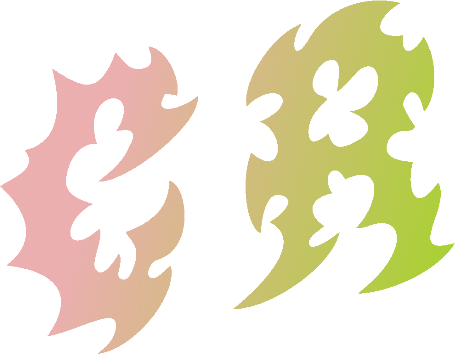
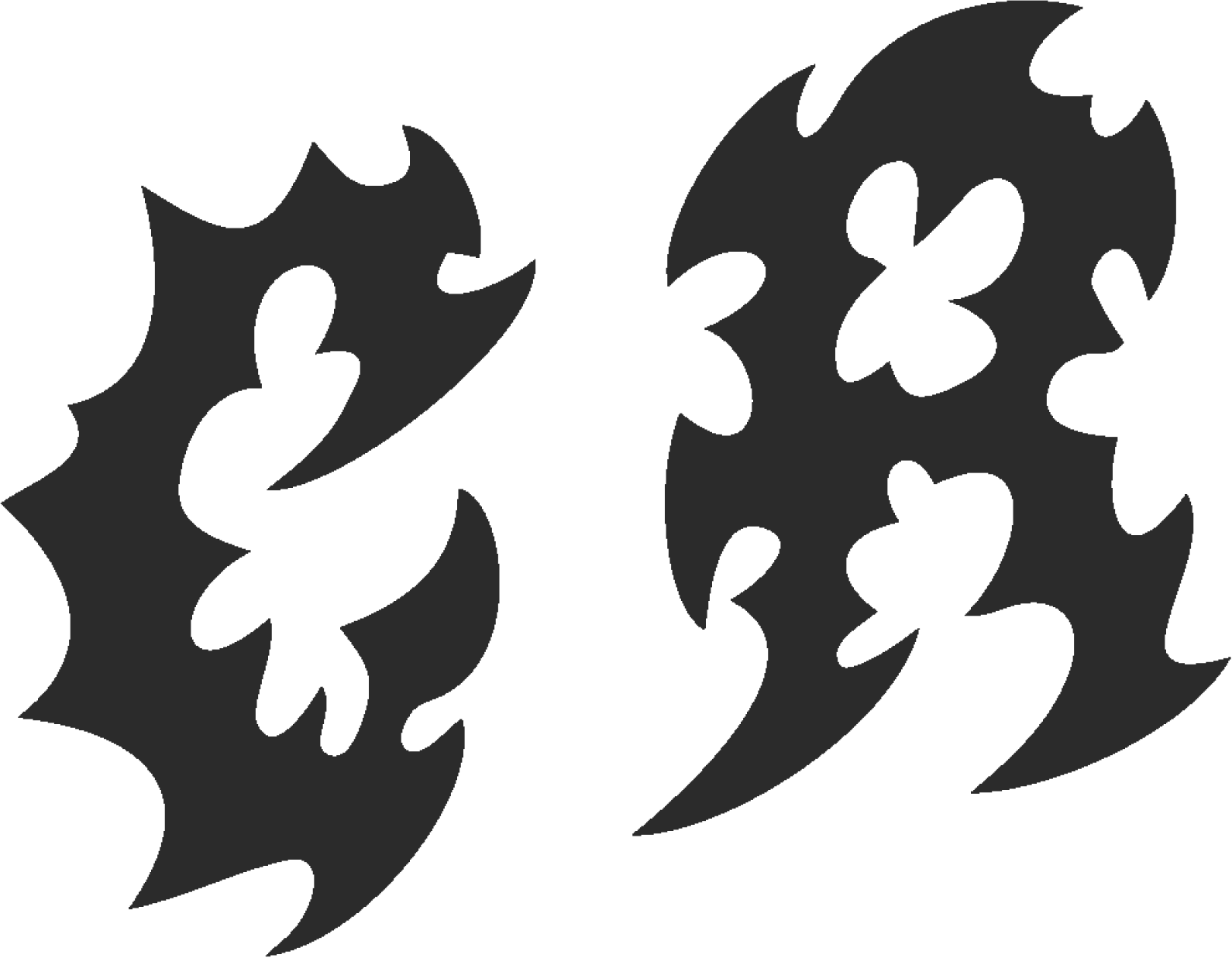
Our logo has three primary versions: Full, Half, and Icon. The choice of logo depends on the available space and context. Each version also has original coloured, light, and dark variations to ensure optimal visibility across different backgrounds.
Full Logo
The full logo is our primary mark and should be used whenever space permits. It includes the full company name and graphic element.

Half Logo
The half logo is used when the full logo is too large or would appear cluttered. It typically shortens the company name or uses a condensed version.
Icon Logo
The icon logo is the smallest and most condensed version, ideal for favicons, app icons, social media profiles, or very limited spaces.
Clear Space & Minimum Size
To ensure legibility and impact, always maintain a clear space around the logo. This space should be equal to at least 'X' (e.g., the height of the 'o' in the logo). Avoid using the logo below a minimum size of 'Y' pixels (e.g., 20px height for the icon logo).
Misuse of Logo
- Do not stretch or distort the logo.
- Do not change the colours of the logo, other than using the approved variations.
- Do not add effects (e.g., shadows, gradients) unless specified.
- Do not place the logo on busy backgrounds that compromise readability.
- Do not rotate the logo.
Typography
Primary Title Font:
Archivo Black
Aa Bb Cc
Headline Example
This is an example of primary text using Archivo Black. It should be used for headlines and strong statements. The quick brown fox jumps over the lazy dog.
Used primarily for H1 headlines, main titles, and strong visual emphasis.
Letter Spacing: -100 (approximately -0.0625em)
Line Height: 0.9
Heading Font:
Lexend Bold
Aa Bb Cc
Section Title Example
This is an example of text using Lexend Bold, ideal for clear and impactful sub-headings. The quick brown fox jumps over the lazy dog.
Used for H2 section titles, sub-headings, and other prominent text elements requiring emphasis.
Letter Spacing: 0 (normal)
Line Height: 1.2
Body Text Font:
Lexend Light
Aa Bb Cc
Paragraph Example
This font is used for all body copy, paragraphs, captions, and other readable content. It is designed for optimal legibility. The quick brown fox jumps over the lazy dog.
To be used for all body copy, paragraphs, and general text content for optimal readability.
Letter Spacing: 0 (normal)
Line Height: 1.2
Colour Palette
Our vibrant colour palette is designed to reflect our brand's energetic and creative spirit. These colours ensure consistency and impact across all visual communications.
Primary Colours
Slime Green
#ABD037
RGB: 171, 208, 55
Riff Rosé
#EAAFAE
RGB: 234, 175, 174
Blackout
#2B2B2B
RGB: 43, 43, 43
White Noise
#FFFFFF
RGB: 255, 255, 255
Secondary Colours
Electric Violet
#5C37D0
RGB: 92, 55, 208
Ghost Note White
#FFF8F8
RGB: 255, 248, 248
Tertiary Colours
Sub Bass Black
#1b1b1b
RGB: 27, 27, 27
Colour Usage Guidelines
- Slime Green & Riff Rosé: Our core brand colours, used for primary branding elements, calls to action, and key visual accents.
- Blackout & White Noise: Essential primary colours for backgrounds, bold text, and ensuring strong contrast.
- Electric Violet & Ghost Note White: Secondary colours for highlights, interactive elements, or to add dynamic flair and subtle background variations.
- Sub Bass Black: Used specifically in gradients with Blackout to create deep, subtle dark transitions.
- Ensure sufficient contrast for accessibility (WCAG 2.1 AA standards) across all colour combinations. Use the Contrast Checker below to verify.
Contrast Checker (WCAG 2.1 AA)
Use this tool to check the contrast ratio between any two colours to ensure accessibility. A ratio of at least 4.5:1 is required for normal text, and 3:1 for large text.
Contrast Ratio:
Gradients
We use a number of gradients primarily for page design and decks, adding depth and visual interest.
Hero Gradient
The hero gradient, a dynamic blend from Riff Rosé to Slime Green, is most notably used as an overlay for images, headers, and hero web/deck pages.
Riff Rosé to Slime Green
#EAAFAE to #ABD037
Secondary Gradients
These gradients are primarily used for web and deck backgrounds. Do not use them for image overlays. Each gradient can be applied in both directions (e.g., Colour A to Colour B, and Colour B to Colour A).
Riff Rosé to Blackout (and vice versa)
#EAAFAE to #2B2B2B
Slime Green to Blackout (and vice versa)
#ABD037 to #2B2B2B
Electric Violet to Blackout (and vice versa)
#5C37D0 to #2B2B2B
Ghost Note White to Riff Rosé (and vice versa)
#FFF8F8 to #EAAFAE
Blackout to Sub Bass Black (and vice versa)
#2B2B2B to #1b1b1b
Layout & Hierarchy
General Layout Principles
Our layouts emphasise clear visual hierarchy and a consistent left-aligned structure. Key elements, especially H1 titles, are designed to sit slightly off the main content grid to create visual interest and impact.
- Always left-align text and primary content blocks for readability.
- H1 titles should be positioned to create a dynamic offset from the main content area, enhancing visual appeal.
- Maintain consistent spacing between sections and elements to ensure a clean and uncluttered design.
- Prioritise information flow, guiding the user's eye naturally through the content.
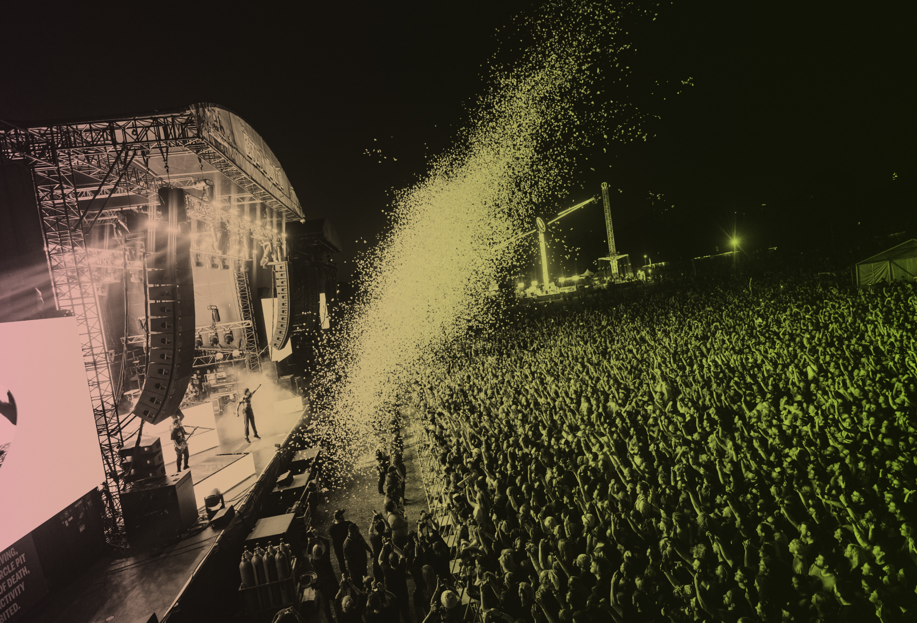
Imagery & Photography
Style & Tone
Our imagery prioritises music-related, fun, and high-quality imagery that resonate with our audience.
Hero Image Usage
For stand-alone hero images, especially on headers or key pages, the Riff Rosé to Slime Green gradient overlay can be used to create a dynamic and impactful visual.
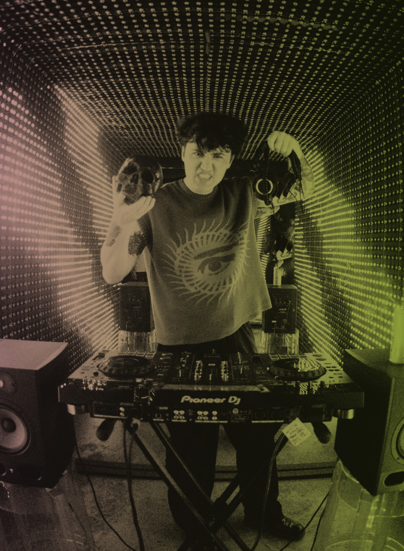
General Image Usage
For smaller images or multiple images on a page, do not use a gradient overlay. Focus on the image's natural qualities. All images should generally have a 24px corner radius.
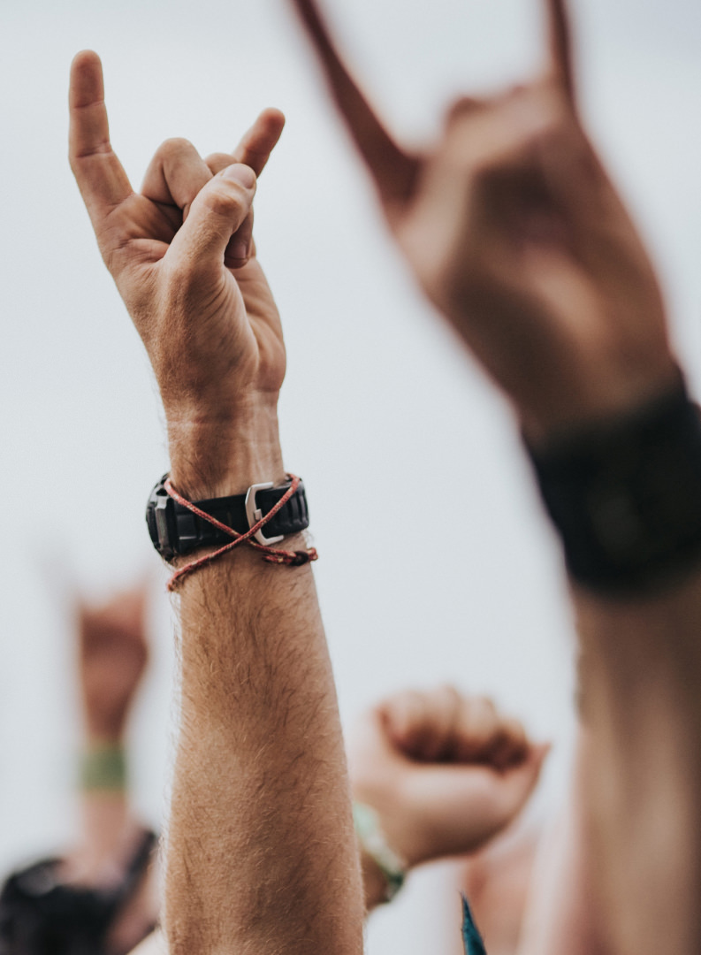
- Use bright, natural lighting and vibrant compositions.
- Focus on diverse representation within the music community.
- Avoid stock photos that look overly generic or staged.
- Maintain a consistent visual style that aligns with our brand's energetic and creative spirit.
Tone of Voice
"Create Racket is a passive revenue platform for artists, fuelled by fan engagement, powered by brand partnerships."
Our brand voice is confident and perfectly positioned to bridge the gap between artists and the media/corporate world. We are the fixers, offering access to the "cool people that the suits can't access." We aim to be cool but not *too* cool, maintaining a friendly, warm, and inviting, inclusive tone.
- Do: Be clear, concise, and confident.
- Do: Use active voice.
- Do: Emphasise our role as a bridge between artists and brands/media.
- Do: Convey a sense of being in-the-know and connected, without being exclusive or elitist.
- Do Not: Use jargon unnecessarily.
- Do Not: Be overly casual or overly formal.